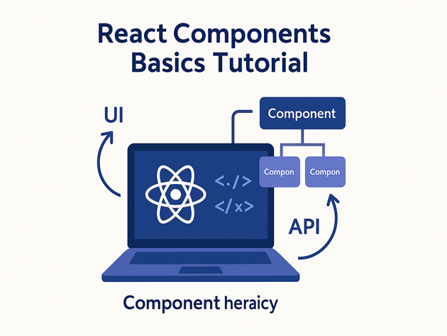
React Components Basics Tutorial for Developers
This React components basics tutorial walks through the concepts you actually use every day: function components, JSX, props, state with hooks and event handlers. Instead of just showing a single counter, we will build a small dashboard-style widget that composes multiple React components and responds to user input.
In this React tutorial you will:
- Set up a minimal React development environment with Vite
- Create your first React component using JSX
- Pass data with props and compose components
- Manage state and events with the
useStatehook - Render lists and derive simple stats from data
To see how this React components basics tutorial fits into a broader stack, you can pair it with:
Node.js backend basics tutorial,
PHP backend basics tutorial,
MariaDB tutorial for developers,
SQL basics tutorial,
Linux basics for developers,
and the Git / CI posts:
Git version control tutorial and
CI/CD pipeline tutorial.
For deeper reference, keep the
official React documentation
open in another tab.
1. React components basics tutorial: the mental model
At the heart of any React components basics tutorial is one idea: a React component is a function that takes props and returns JSX. React keeps a virtual representation of the UI and updates the browser DOM efficiently when props or state change.
- Component – a function or class that returns JSX.
- JSX – HTML-like syntax that compiles to
React.createElementcalls. - Props – inputs from parent components.
- State – internal data that can change over time.
In practice, you build a screen by composing many small components instead of writing one giant template.
2. Set up a minimal React + Vite project
To make this React components basics tutorial concrete, we will use Vite to bootstrap a modern React app with minimal configuration.
2.1 Create the project
npm create vite@latest react-components-demo -- --template react
cd react-components-demo
npm install
npm run dev
Open the printed localhost URL in your browser. You should see the default Vite + React starter.
2.2 Clean up the starter
Next, simplify the starter so this React components basics tutorial can focus on your own components. Replace the contents of src/App.jsx with a tiny placeholder:
export default function App() {
  return (
    <main style={{ padding: "1.5rem", fontFamily: "system-ui" }}>
      <h1>React Components Basics Tutorial</h1>
      <p>We will build a small dashboard widget step by step.</p>
    </main>
  );
}
Once this is working, you are ready to start building out real React components.
3. Create your first React component
Let’s begin the hands-on part of this React components basics tutorial by writing a simple stat summary component that accepts a title and a numeric value.
3.1 Simple function component
Add a file src/components/StatCard.jsx:
export default function StatCard({ label, value }) {
  return (
    <div
      style={{
        borderRadius: "0.75rem",
        padding: "1rem 1.25rem",
        border: "1px solid #e2e8f0",
        background: "#0f172a",
        color: "#e2e8f0",
      }}
    >
      <div style={{ fontSize: "0.85rem", opacity: 0.8 }}>{label}</div>
      <div style={{ fontSize: "1.6rem", fontWeight: 600 }}>{value}</div>
    </div>
  );
}
Then update src/App.jsx to use this React component:
import StatCard from "./components/StatCard.jsx";

export default function App() {
  return (
    <main style={{ padding: "1.5rem", fontFamily: "system-ui", background: "#020617", minHeight: "100vh", color: "#e2e8f0" }}>
      <h1 style={{ fontSize: "1.8rem", marginBottom: "0.5rem" }}>
        React Components Basics Tutorial
      </h1>
      <p style={{ marginBottom: "1.5rem", maxWidth: 620 }}>
        Below is a tiny dashboard made from reusable React components:
        cards, lists and buttons. We will extend it as we go.
      </p>

      <section style={{ display: "grid", gap: "1rem", gridTemplateColumns: "repeat(auto-fit, minmax(180px, 1fr))" }}>
        <StatCard label="Active users" value="128" />
        <StatCard label="Errors (24h)" value="3" />
        <StatCard label="Conversion %" value="4.2%" />
      </section>
    </main>
  );
}
Notice how the React component function returns JSX and uses props to fill in values. That pattern is the foundation for the rest of this React components basics tutorial.
4. Pass props and compose components
Now we will add a list of “alerts” under the stats area to show how React components can render arrays and compose together.
4.1 Alerts list component
Create src/components/AlertList.jsx:
function AlertItem({ level, message }) {
  const color =
    level === "critical" ? "#f97373" : level === "warning" ? "#facc15" : "#22c55e";

  return (
    <li
      style={{
        display: "flex",
        alignItems: "center",
        gap: "0.75rem",
        padding: "0.5rem 0.75rem",
        borderRadius: "0.75rem",
        background: "#020617",
        border: "1px solid #1f2933",
      }}
    >
      <span
        style={{
          width: "0.75rem",
          height: "0.75rem",
          borderRadius: "999px",
          background: color,
        }}
      />
      <span style={{ fontSize: "0.9rem" }}>{message}</span>
    </li>
  );
}

export default function AlertList({ alerts }) {
  if (!alerts.length) {
    return <p style={{ opacity: 0.7 }}>No alerts. All clear.</p>;
  }

  return (
    <ul style={{ listStyle: "none", padding: 0, margin: 0, display: "grid", gap: "0.5rem" }}>
      {alerts.map((alert) => (
        <AlertItem
          key={alert.id}
          level={alert.level}
          message={alert.message}
        />
      ))}
    </ul>
  );
}
4.2 Use the component in App
Update src/App.jsx to include AlertList:
import StatCard from "./components/StatCard.jsx";
import AlertList from "./components/AlertList.jsx";

const initialAlerts = [
  { id: 1, level: "critical", message: "Checkout failures spiking in EU region" },
  { id: 2, level: "warning", message: "Increased latency on analytics API" },
];

export default function App() {
  return (
    <main style={{ padding: "1.5rem", fontFamily: "system-ui", background: "#020617", minHeight: "100vh", color: "#e2e8f0" }}>
      <h1 style={{ fontSize: "1.8rem", marginBottom: "0.5rem" }}>
        React Components Basics Tutorial
      </h1>
      <p style={{ marginBottom: "1.5rem", maxWidth: 620 }}>
        This mini dashboard is built entirely from reusable React components:
        cards for stats, a list for alerts, and buttons for user actions.
      </p>

      <section style={{ display: "grid", gap: "1.5rem" }}>
        <div style={{ display: "grid", gap: "1rem", gridTemplateColumns: "repeat(auto-fit, minmax(180px, 1fr))" }}>
          <StatCard label="Active users" value="128" />
          <StatCard label="Errors (24h)" value="3" />
          <StatCard label="Conversion %" value="4.2%" />
        </div>

        <section>
          <h2 style={{ fontSize: "1.2rem", marginBottom: "0.5rem" }}>Latest alerts</h2>
          <AlertList alerts={initialAlerts} />
        </section>
      </section>
    </main>
  );
}
At this point, you have multiple React components working together, which is exactly the kind of structure this React components basics tutorial wants to highlight.
5. Add state and events with hooks
Next, this React components basics tutorial introduces state and event handlers so users can interact with your dashboard. You will add a button that simulates “acknowledging” alerts.
5.1 useState hook in App
Modify src/App.jsx to store alerts in state and add a button that clears them:
import { useState } from "react";
import StatCard from "./components/StatCard.jsx";
import AlertList from "./components/AlertList.jsx";

const seededAlerts = [
  { id: 1, level: "critical", message: "Checkout failures spiking in EU region" },
  { id: 2, level: "warning", message: "Increased latency on analytics API" },
];

export default function App() {
  const [alerts, setAlerts] = useState(seededAlerts);

  const hasAlerts = alerts.length > 0;

  function handleAcknowledgeAll() {
    setAlerts([]);
  }

  return (
    <main style={{ padding: "1.5rem", fontFamily: "system-ui", background: "#020617", minHeight: "100vh", color: "#e2e8f0" }}>
      <h1 style={{ fontSize: "1.8rem", marginBottom: "0.5rem" }}>
        React Components Basics Tutorial
      </h1>
      <p style={{ marginBottom: "1.5rem", maxWidth: 620 }}>
        Use this mini dashboard to practice React component basics: JSX,
        props, state and events. Try acknowledging the alerts below.
      </p>

      <section style={{ display: "grid", gap: "1.5rem" }}>
        <div style={{ display: "grid", gap: "1rem", gridTemplateColumns: "repeat(auto-fit, minmax(180px, 1fr))" }}>
          <StatCard label="Active users" value="128" />
          <StatCard label="Open alerts" value={alerts.length} />
          <StatCard label="Errors (24h)" value="3" />
        </div>

        <section>
          <header style={{ display: "flex", alignItems: "center", justifyContent: "space-between", marginBottom: "0.75rem" }}>
            <h2 style={{ fontSize: "1.2rem" }}>Latest alerts</h2>
            <button
              type="button"
              disabled={!hasAlerts}
              onClick={handleAcknowledgeAll}
              style={{
                padding: "0.4rem 0.9rem",
                borderRadius: "999px",
                border: "1px solid #334155",
                background: hasAlerts ? "#243465" : "#111827",
                color: "#e2e8f0",
                fontSize: "0.85rem",
                cursor: hasAlerts ? "pointer" : "default",
                opacity: hasAlerts ? 1 : 0.6,
              }}
            >
              Acknowledge all
            </button>
          </header>

          <AlertList alerts={alerts} />
        </section>
      </section>
    </main>
  );
}
Now the UI updates when you click the button; React re-renders components based on the new state while preserving the component structure.
6. Recap: small React components basics cheat sheet
To close this React components basics tutorial, here is a compact cheat sheet summarizing the building blocks you’ve used and how often they show up in real-world React projects.
| Concept | Example | Purpose | Relative Usage |
|---|---|---|---|
| Function components | function MyComponent(props) { ... } |
Describe UI for given inputs | |
| JSX | <Button label="Save" /> |
Readable markup-like syntax | |
| Props | {label}, {value} |
Pass data from parent to child | |
| State & hooks | const [x, setX] = useState() |
Track changing data over time | |
| Composition | <Dashboard><StatCard /></Dashboard> |
Build UIs from smaller pieces |
Once you are comfortable with these React component basics, you can move into more advanced topics like custom hooks, context, data fetching with libraries like React Query and integrating your React UI with Node.js, PHP or other backends from the rest of your stack.